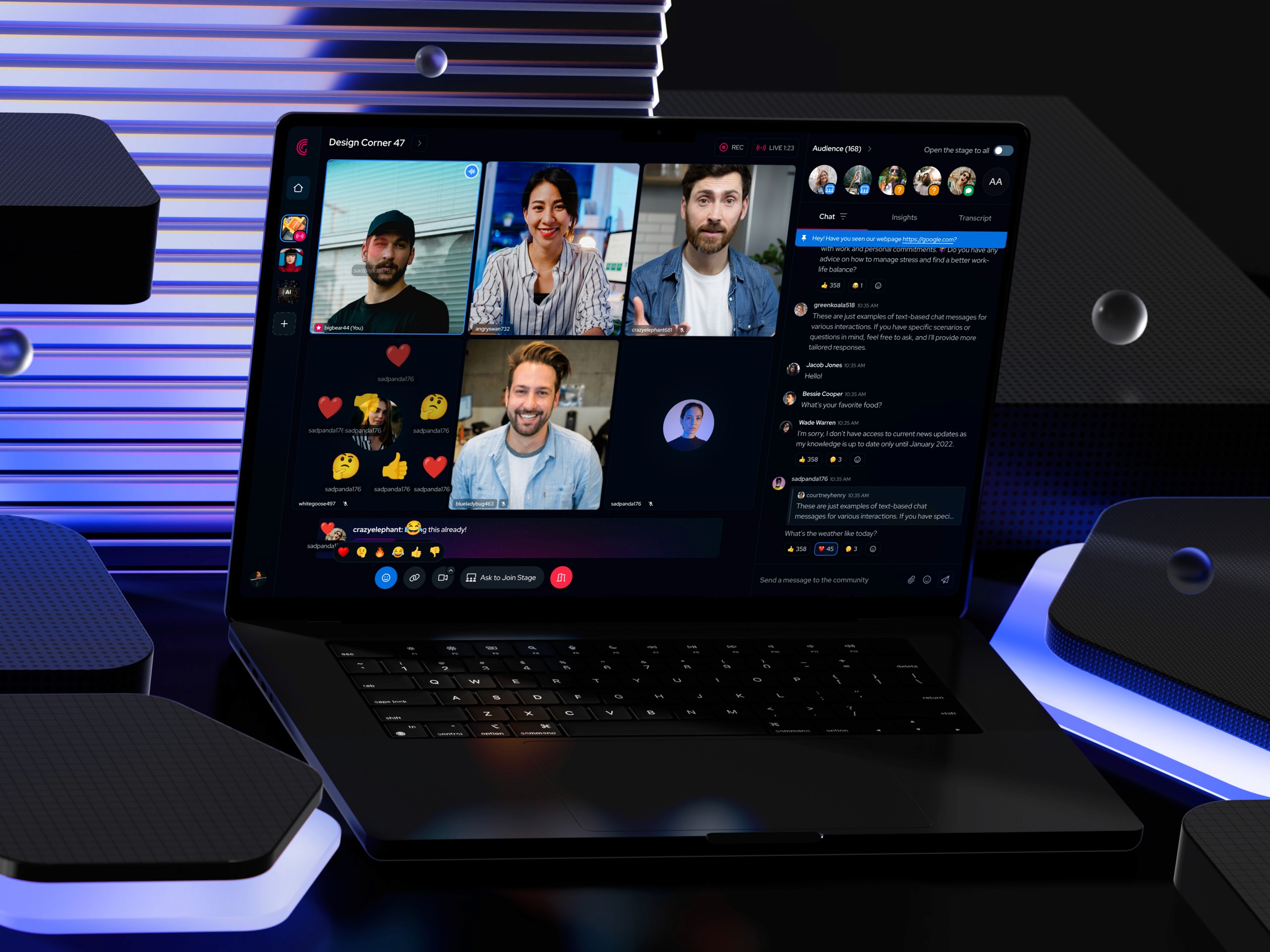
A product design project covering the full daily banking surface of a major Nordic bank's mobile app. From how the home screen communicates financial status, to how users get a card, manage it across six distinct states, and receive proactive notifications when something demands their attention.

The landscape this work operates in
Mobile banking in Europe has crossed a threshold. According to Forrester's 2024 Digital Experience Review, 85% of customers now use their banking app regularly — and nearly a third are mobile-only, meaning the app is their entire relationship with the bank. The branch is no longer the primary channel. The app is.
Customers evaluate their bank's app on three things above everything else: how quickly they can complete what they came to do, how clearly the app communicates financial information, and whether the experience feels secure. These are not soft metrics — they translate directly into satisfaction scores, retention, and support volume.
The bank has built its reputation on exceptional personal banking. The challenge at the product level is ensuring the mobile experience reflects that same quality of service — precise, reliable, and respectful of the user's time.
Users don't open banking apps to view accounts. They open them to complete tasks. Every design decision in this project starts from that premise.
Where the experience broke down
The existing app had solid foundational functionality — but the daily banking experience carried the characteristic friction of legacy banking UX. It was organized around data structures rather than user intent: account lists were the first thing you saw, actions were secondary, and the card experience existed as a separate section disconnected from account context.
Three structural problems drove the redesign:
The home screen told you things instead of helping you do things. A dense list of accounts dominated the view, but the actions users arrived to complete — making a payment, checking a balance, managing a card — required navigating away first. Every session started with a step that didn't need to exist.
Card management was fragmented and hard to reach. Cards existed outside the flow of account management. In moments that demand speed — suspecting fraud, needing to freeze a card immediately — extra navigation steps create real anxiety. The mental model of "my card belongs to my account" wasn't reflected in the interface.
The app was reactive when it needed to be proactive. Users were not alerted to upcoming payment failures until the failure had already occurred. A scheduled payment failing silently is a trust-damaging event. The app had the data to warn users in advance and wasn't using it.
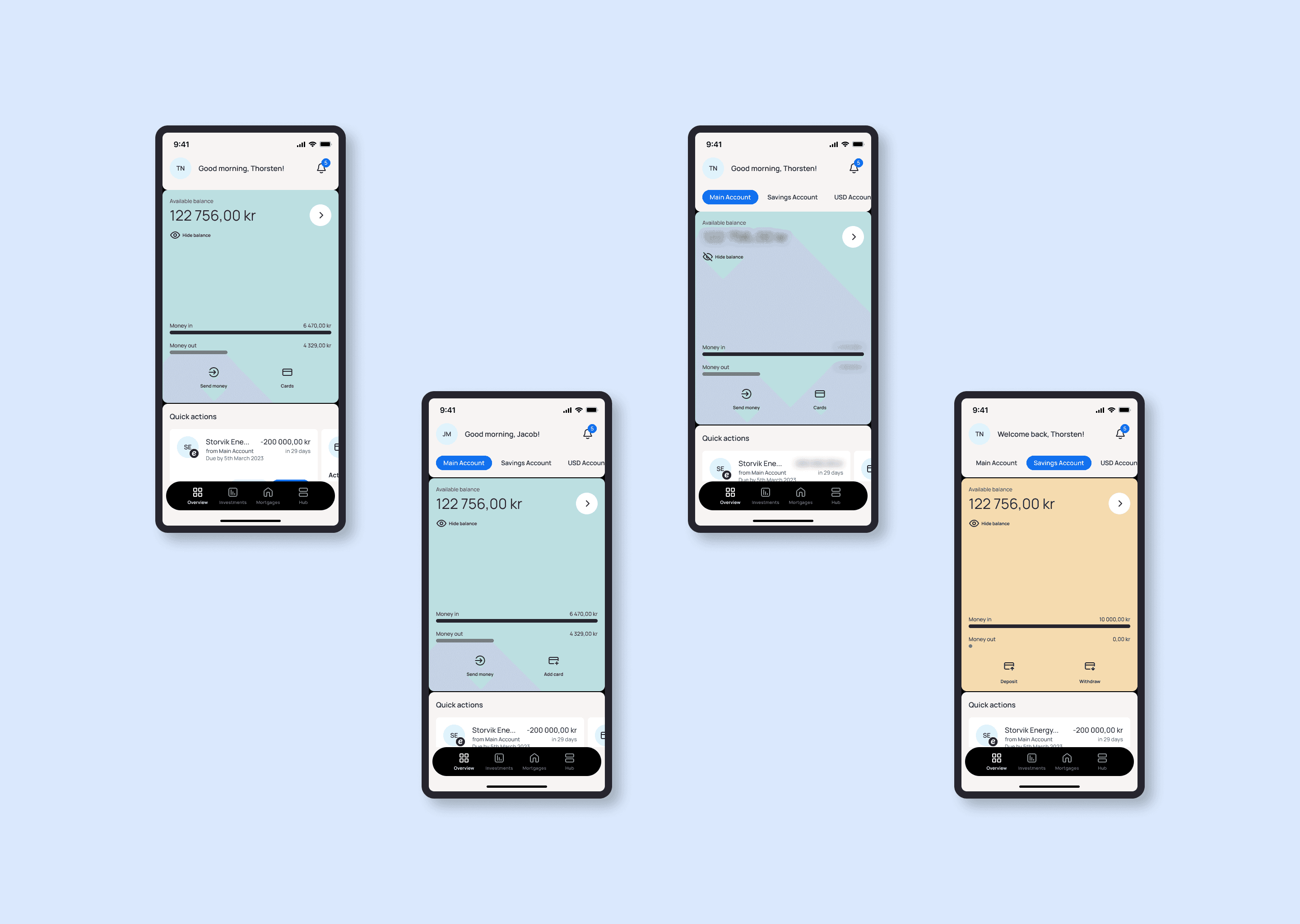
Home screen redesign: Organizing the home screen around intent, not data
The action-first dashboard
The fundamental reorganization of the home screen was built on a simple reframing: the home screen exists to help users complete their most common tasks, not to display an inventory of accounts. This changes what belongs at the top of the screen, and why.
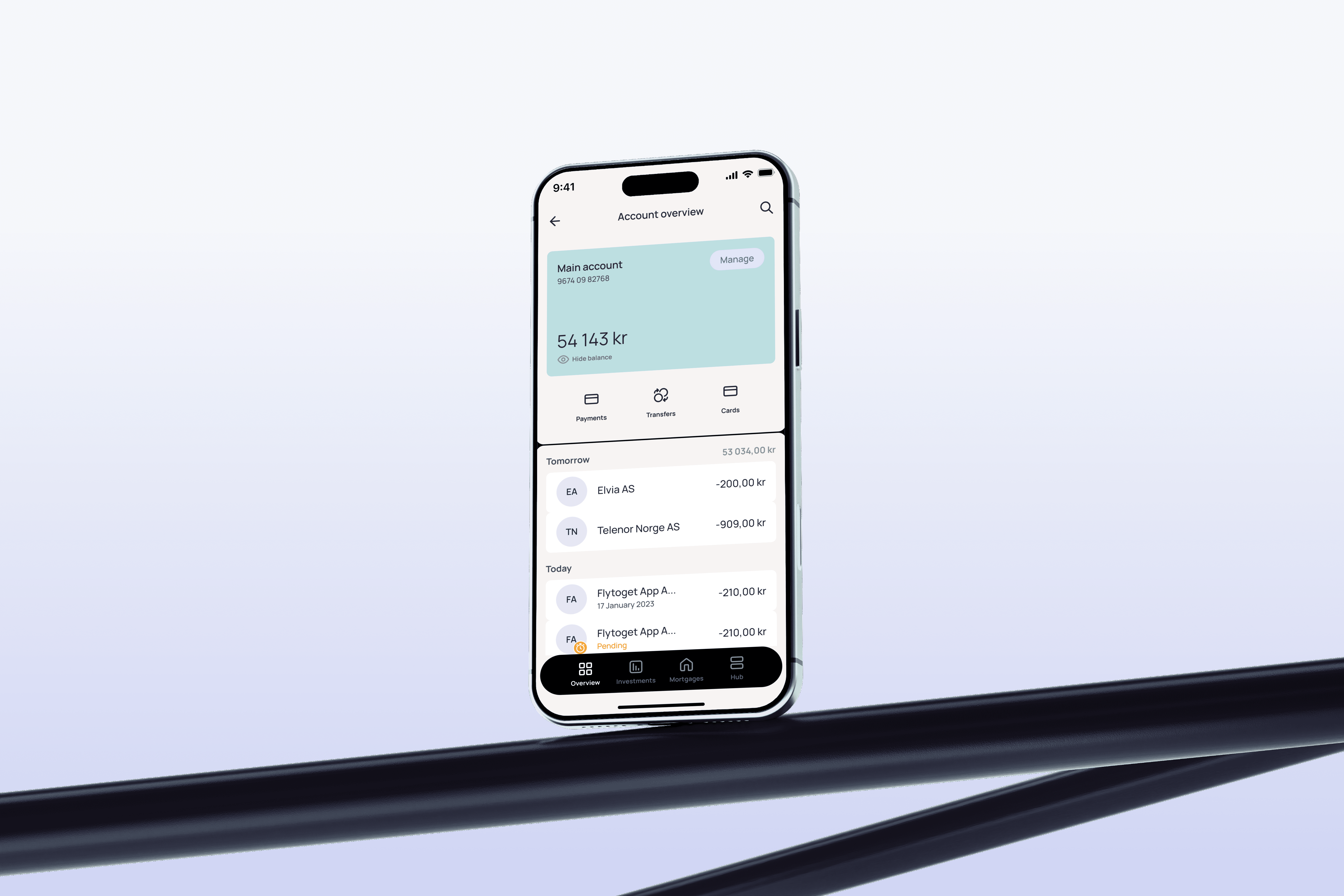
The redesigned layout opens with total balance and the primary account — enough orientation to answer "am I okay?" at a glance. Immediately below sits a persistent row of quick actions: Send, Pay, Transfer, Card controls. These four cover the overwhelming majority of reasons someone opens the app. Placing them in the top quarter of the screen means most sessions can be completed with a single tap before the user has scrolled at all.
Recent transactions follow the action row, surfacing the information users most often want to verify after completing an action. Secondary accounts are grouped below — visible, but no longer competing visually with the primary account and the action layer above.
Design rationale
The order of elements on screen is an implicit statement about what matters. When account lists appear before actions, the interface says: "Here is your data — now decide what to do with it." When actions appear before lists, it says: "Here's what you can do — here's the context if you need it." The second framing is how banking apps should work.
Clearer information hierarchy
Alongside the structural reorder, the visual hierarchy within the account layer was overhauled. In the previous design, all accounts were presented at equal weight — the same card size, the same typography, the same visual emphasis. For users with multiple accounts, this meant scanning through equal-looking items to find what they actually cared about.
The redesign establishes a clear primary/secondary distinction. The main account — typically the everyday current account — is visually dominant: larger treatment, more prominent balance display, leading position. Secondary accounts (savings, loans, secondary current accounts) are grouped below and subordinated typographically. The result is a home screen that communicates financial status in under two seconds of scanning, without requiring the user to mentally filter through equal-weight content.
Spacing and typography were recalibrated throughout to support this hierarchy rather than fight it. White space isn't decoration here — it's the mechanism that makes the hierarchy readable.
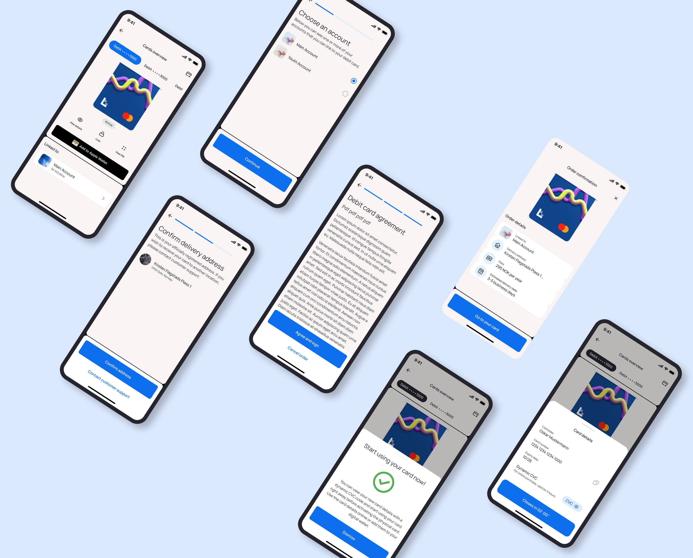
Card ordering: Getting a card: six entry points, one coherent experience
Card ordering surfaces in six different contexts depending on where the user is in the app and whether they already have a card. Each context required a distinct design treatment, while the underlying ordering flow had to remain consistent throughout.
The core tension was between discoverability and visual weight. Ordering a card for the first time is a significant moment — the user needs clear direction and a prominent CTA. Ordering a second card is a more considered action, and an icon-based entry point is enough without disrupting the hierarchy of the surrounding content.
On the homepage with no card, a full "Order new card" CTA is surfaced at the bottom of the screen. There is no cards overview page to navigate to — the action is immediate and foregrounded. For users who already have a card, the entry point for ordering a second is available but visually subordinated, so it doesn't compete with the primary content.
From the cards overview page, a card icon in the header signals the action. At this point in the navigation the user is already in card management context, so the icon alone is sufficient — a full label would add noise without adding clarity.
The account details page presented the most nuanced challenge. When no card is linked to an account at all, a strong visual CTA surfaces — but the design constraint was making it feel contextually relevant without pushing essential account information below the fold. When a subsequent card can be ordered without one currently linked, a card icon handles the entry point cleanly. And when a card already exists in the account, the icon appears alongside the visible card — making it clear that one card is active while keeping the path to ordering another open.
What this taught me
The hardest part wasn't designing the ordering flow itself — it was mapping every surface where the action could plausibly appear and deciding, for each one, what form it should take. That kind of thinking only comes from spending real time in the product, understanding how users move across contexts rather than within a single screen.
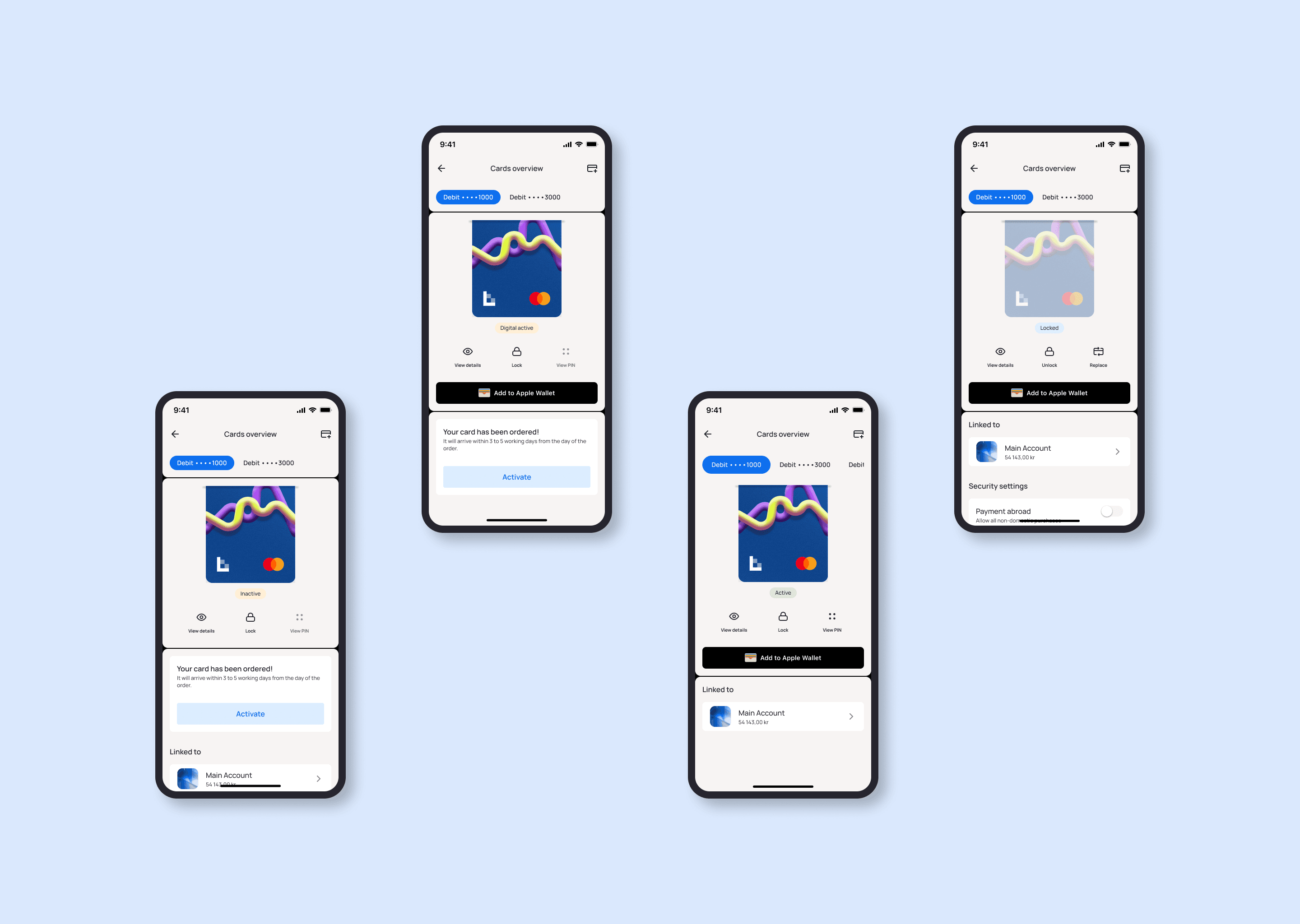
Card management: Managing cards: actions, states, and the frozen card problem
Card management is the part of the experience users need most when they're most stressed. Suspecting fraud, needing a PIN, checking whether a replacement card has arrived — these are moments where a slow or unclear interface directly damages trust. The design needed to be fast, unambiguous, and complete.
Hierarchy of actions
Card actions are organized into two tiers based on frequency and consequence. Core actions — freeze/unfreeze, view card details, view PIN — are surfaced immediately and prominently. These are the things users reach for often, and sometimes urgently. Secondary actions — reissue card, set limits, block card online — sit one level deeper. They're less frequent, higher consequence, and benefit from a moment of friction that makes the user pause before proceeding.
Card statuses: communicating state at a glance
A card's status fundamentally changes what a user can do with it, and the interface needs to communicate that state immediately — not buried in a detail page. Six statuses were designed with distinct visual treatments:
Inactive / On its way
Active online only
Active
Frozen
Expiring
Blocked
The frozen card design problem
The frozen state presented a specific design decision that deserves explanation. When a card is frozen, most management actions become unavailable. The question was: should unavailable actions be hidden, or shown as disabled?
Design decision
Hiding options would be simpler visually — a cleaner screen with fewer elements. But it creates a different problem: users familiar with the interface suddenly see a depleted menu and may not understand why. Showing options as disabled communicates that the freeze is temporary and reversible, that the feature exists, and that unfreezing will restore full functionality. The only active action in the frozen state is unfreeze — everything else is present but grayed out. This preserves orientation without implying availability.
Card details: number, CVC, and digital CVC
Card details — card number, CVC, and digital CVC — can be viewed in-app and the card number copied directly to clipboard. This removes a friction point that occurs constantly: whenever a user wants to make an online purchase without their physical card present, they previously had no clean path. The digital CVC code is shown alongside the physical CVC — both visible in the same view — covering both card-not-present and digital wallet scenarios in a single, unambiguous screen.
PIN reminder: a placement decision
Where PIN reminder should live was a genuinely open question. Two approaches were explored: placing it within the "Manage cards" section alongside other settings, or elevating it to a dedicated CTA button directly under the card — which would mean four icon buttons at that level rather than three. The decision hinges on usage frequency: PIN retrieval is common enough to warrant prominent placement, but a fourth icon button changes the visual rhythm of the card surface and risks clutter. This was documented as an open decision to validate with usage data.
Extended manage card actions
A set of higher-consequence management actions are available within the manage card flow: change PIN, replace card, regional block (payments abroad), and terminate card agreement. These actions carry real financial and operational weight — they're accessible, but not fast to reach by accident.
Apple Pay integration
Adding a card to Apple Pay is surfaced as a dedicated action from the card view, using the native Wallet passkit flow rather than a custom UI. This respects the operating system's established patterns and carries the credibility of a familiar, trusted interaction.
What changes across the product
The improvements across these three areas compound in their effect. A home screen reorganized around action reduces time-to-task on every session. A card management experience that communicates status clearly and keeps critical controls within reach reduces stress in the moments that matter most. Proactive notifications replace a reactive, silent failure loop with one that treats users as partners in managing their finances.
↓ taps
to complete the most common banking tasks from home
1 tap
to freeze or unfreeze a card in a critical moment
6 states
card statuses communicated clearly and immediately
6 flows
card ordering entry points with contextually appropriate design
3 alerts
proactive and reactive notifications with direct recovery paths
↓ load
cognitive effort through clearer home screen hierarchy
At the product level, these changes support higher self-service engagement, reduced dependency on branch and support contact for routine card tasks, and an app that reflects the quality of relationship the bank is known for — reliable, clear, and on the user's side.
What guided every decision
Action over information
Recognition over recall
Progressive disclosure
Consistency = trust
Proactive over reactive
Evolution over disruption
Context shapes form
What this project is really about
Banking design is unusual because the stakes of getting it wrong are real and immediate. A confused user on an e-commerce site might abandon a checkout. A confused user in a banking app might fail to freeze a stolen card in time, miss an invoice deadline, or watch a scheduled payment fail without understanding why. The design isn't abstract — it's sitting between the user and their money.
The happy paths are straightforward. The challenge is in the edge cases: what does the interface show when every card action is unavailable? What's the right form of a "get a card" CTA when the user is already looking at their account details and content space is limited? How do you design a notification that feels like the bank is looking out for the user, not alarming them unnecessarily?
These decisions don't show up in a single screen — they emerge from understanding the full flow, the full range of states, and the moments where the user is most vulnerable to friction.
Meaningful improvement in banking UX doesn't come from reinventing the interface. It comes from systematically removing friction from the actions users take every single day — and being there, clearly, when something goes wrong.